
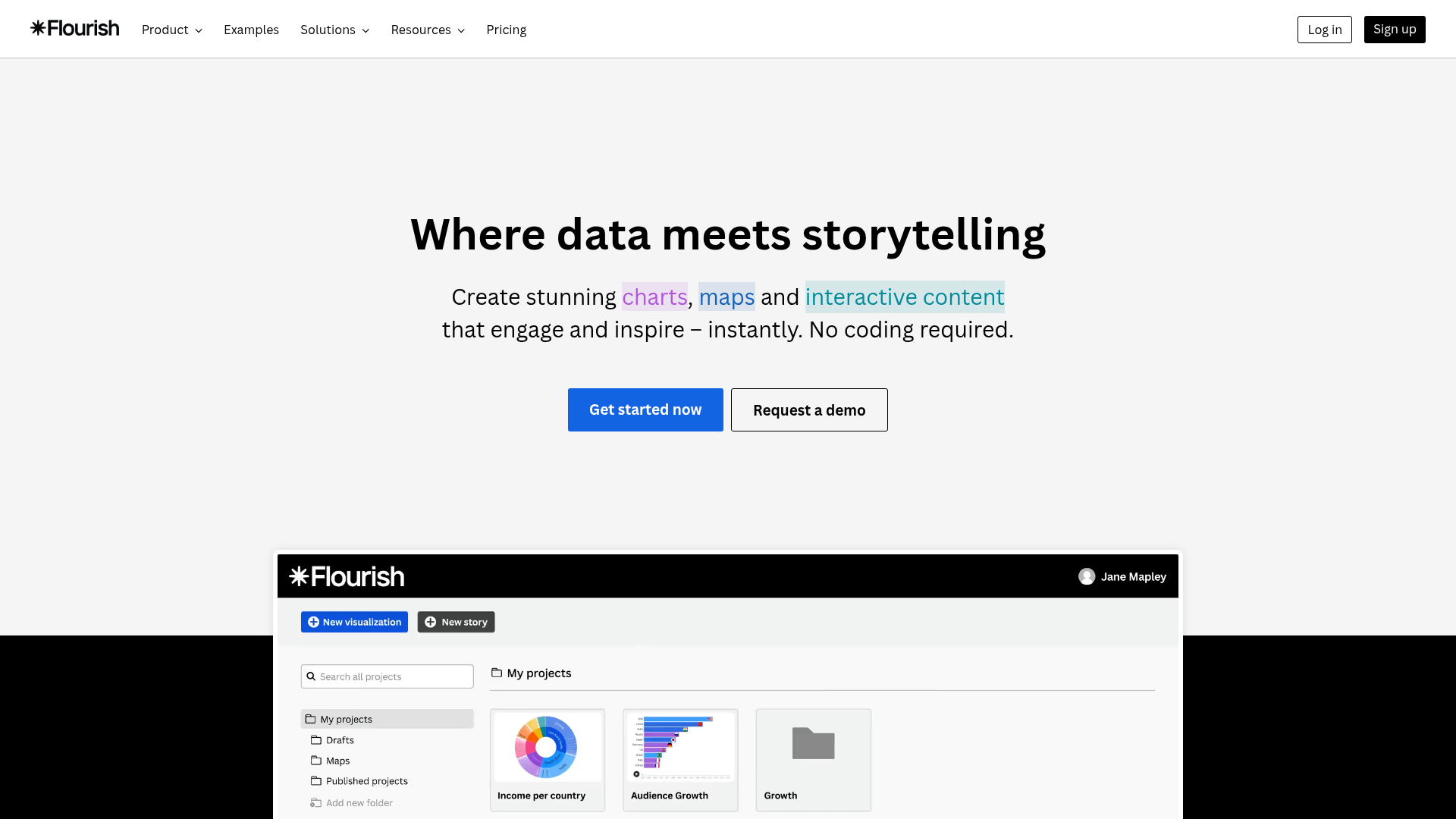
Data-driven content consistently outperforms opinion content in terms of shares, backlinks, and credibility. Flourish lets creators turn any dataset into compelling visual content — bar chart races, interactive maps, timeline animations, scatter plots, and scrollytelling narratives — without writing a single line of code. Import your data from a spreadsheet, choose a template, and publish an interactive visualization in minutes.
Bar Chart Races. animated races showing changing rankings over time (viral social format)
Interactive Maps. choropleths, dot maps, 3D globe visualizations, and grid maps
Scrollytelling. narrative data stories that unfold as the reader scrolls through content
Line, scatter, and area charts. clean, publication-quality static and animated charts
Sankey diagrams, Streamgraphs, Parliament charts, and other specialized visualization types
Live-updating dashboards. charts that pull live data from connected spreadsheets automatically
Who Is It For?
Content creators, journalists, and marketers who want to add interactive charts, maps, and data visualisations to their content without needing coding skills. Particularly useful for anyone producing data-driven or research-backed content who wants to present information visually rather than in tables.
If you only need basic charts for internal presentations, Google Slides and Excel have built-in chart tools that are faster for simple use cases. Flourish adds the most value when the visualisation itself will be embedded or published for an audience to explore.
Pros and Cons
- ✅ Beautiful, interactive visualisations without coding
- ✅ Wide range of chart types and map formats
- ✅ Embedded in websites and articles easily
- ✅ Free for public projects
- ❌ Free plan makes all projects public — not suitable for confidential data
- ❌ Complex data formatting requirements can be a barrier
- ❌ Some visualisation types require paid plans
Pricing
Flourish is free for public projects. Paid plans start from around $99/month for private projects and additional features.
Summary
Flourish is one of the best tools available for creating publication-quality interactive data visualisations without technical skills. For content creators producing data-driven articles, YouTube videos with data narratives, or newsletter infographics, it lifts the quality of visual presentation significantly. The free public tier is genuinely capable.